Active Horizens
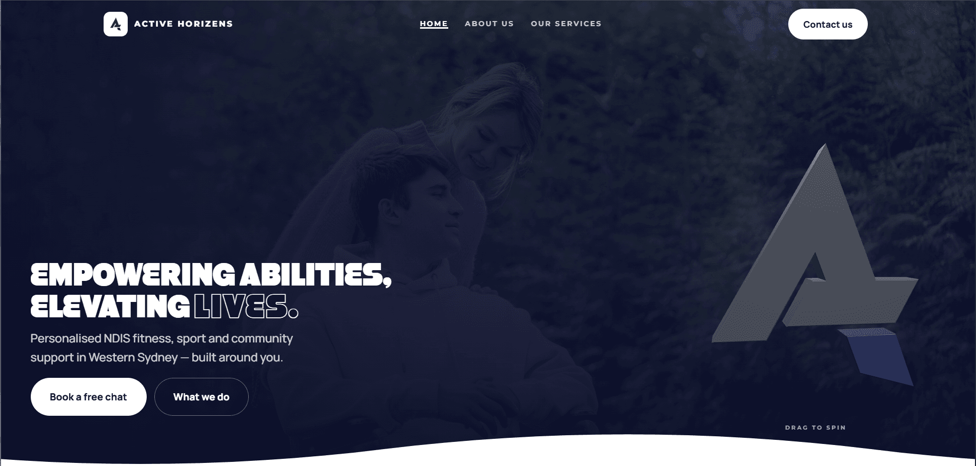
A website, a booking calendar and an analytics platform for two NDIS support workers in Western Sydney. Built so a nervous parent and a busy support coordinator can both get what they need from the same page.
Scroll to explore
A website that has to earn trust
Active Horizens is Mitchell and Destiny. Two support workers running NDIS-funded fitness, sport and community access around Western Sydney. They had the certificates, the insurance, a service agreement and real participants. What they didn't have was anywhere to send someone who asked what they actually do.
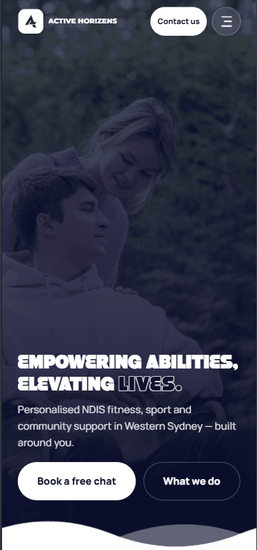
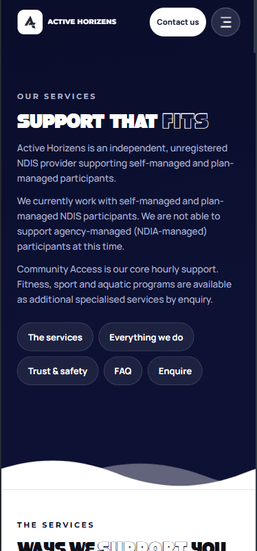
The brief said website. The real problem turned up in their service agreement. They work as an independent, unregistered provider with self-managed and plan-managed participants. That sentence matters enormously to the people who need them and means nothing to anybody else. Word it wrong and you either turn away participants you could help, or claim a registration you don't hold.
I did the brand, the site, the booking calendar, the enquiry pipeline and an analytics dashboard they log into themselves. All of it is theirs at handover.
Three people. One page
Most provider websites are written for one of these three and lose the other two. This one had to serve all of them without reading like a committee wrote it.
Often nervous. Often burned by something that felt clinical or judgemental. Plain English, no jargon, nothing that sounds like a form.
Professional gatekeepers with a dozen providers to choose between. Scanning for credentials, insurance, pricing and clarity. They want structure.
A brand new domain with no history, up against providers who have been around for years.
By the numbers
Navy, and one rule
The business turned up in bright orange, then commissioned a new logo halfway through the build. Charcoal and deep navy, wide geometric wordmark. Good mark. It meant redoing things I had already delivered.
The orange had to go completely
Not softened. Not kept as an accent. Half-changed brands look like an accident, so I pulled it out of every asset, including the PDFs I had already handed over, and rebuilt those from scratch.
Navy also won on a boring technical point. White text sits on every step of the ramp at readable contrast. Orange never did.
Two fonts, and no italics
Montserrat at its heaviest for headings, because it has the width to carry short uppercase lines. Manrope for anything you actually read, because its letters stay open at small sizes and that is where nearly all this traffic lives.
Then one rule everywhere, including the PDFs: no italics. Italic Montserrat looks weak, and a system with one banned tool is a system people actually follow.
Numbers off a list, not out of a feeling
Every gap, button height and corner radius comes from a fixed scale. A script runs over each build and flags anything that isn't on it. It caught several I had nudged by eye.
It is the difference between a site that feels designed and one that feels assembled.
Outlined words, thinner on phones
Key words in the headings are drawn as outlines instead of solid fills. At 2px on a 360-wide phone the counters fill in and the word turns to mud, so the stroke steps down to 1.5.
You only catch that on a real phone, not a resized browser window.
Water that behaves like water
Half of what they do happens in a pool. Hydrotherapy, swimming, water fitness for people whose joints hurt on land. So the main buttons fill with water. Every water button on the internet is a CSS blob wobbling on a loop, which is exactly the trap. I wrote the wave maths instead.
Real water is not a sine wave
A sine wave gives you rounded humps. Real crests pinch sharp and lean the way they are travelling, and the troughs go wide and flat. That happens because the surface rolls in circles rather than bobbing straight up and down, so every point on it moves sideways as well as up.
Several waves of different lengths and speeds get added together, and two sets travel in opposite directions so they tumble over each other instead of marching in step. Each one starts at a random point in its cycle, so no two buttons on a page are ever in sync.
It sloshes, then settles
The water level is a damped spring, not a CSS transition. Press the button and the level overshoots its target, comes back, settles. Let go and it drains with the same weight behind it.
Small thing. It is the difference between a button that fills and a glass that fills.
It churns while it fills
How fast the level is currently moving feeds straight back into the wave height and speed. So the surface gets choppy while it fills and flattens out as it settles, the way water does in a glass you have just put down. It decays off rather than stopping dead.
When nothing is moving, the animation loop shuts itself down. A page sitting open in a tab burns no frames.
Every section ends in a waterline
The joins between sections are moving water, not straight lines. The trick is that the divider is painted the colour of the section above it, and the wave shape is filled with the colour of the section below, so the wave is the boundary instead of a decorative band stuck between two blocks.
Two layers drift at different speeds, 19 seconds and 12, which reads as depth rather than a sliding graphic. Because each divider takes its colours from its neighbours, sections can be reordered without anyone editing a hex value by hand.

The hard parts
Four things on this project took far longer than the estimate said they would. Three of them were worth it.
The section that took ten goes
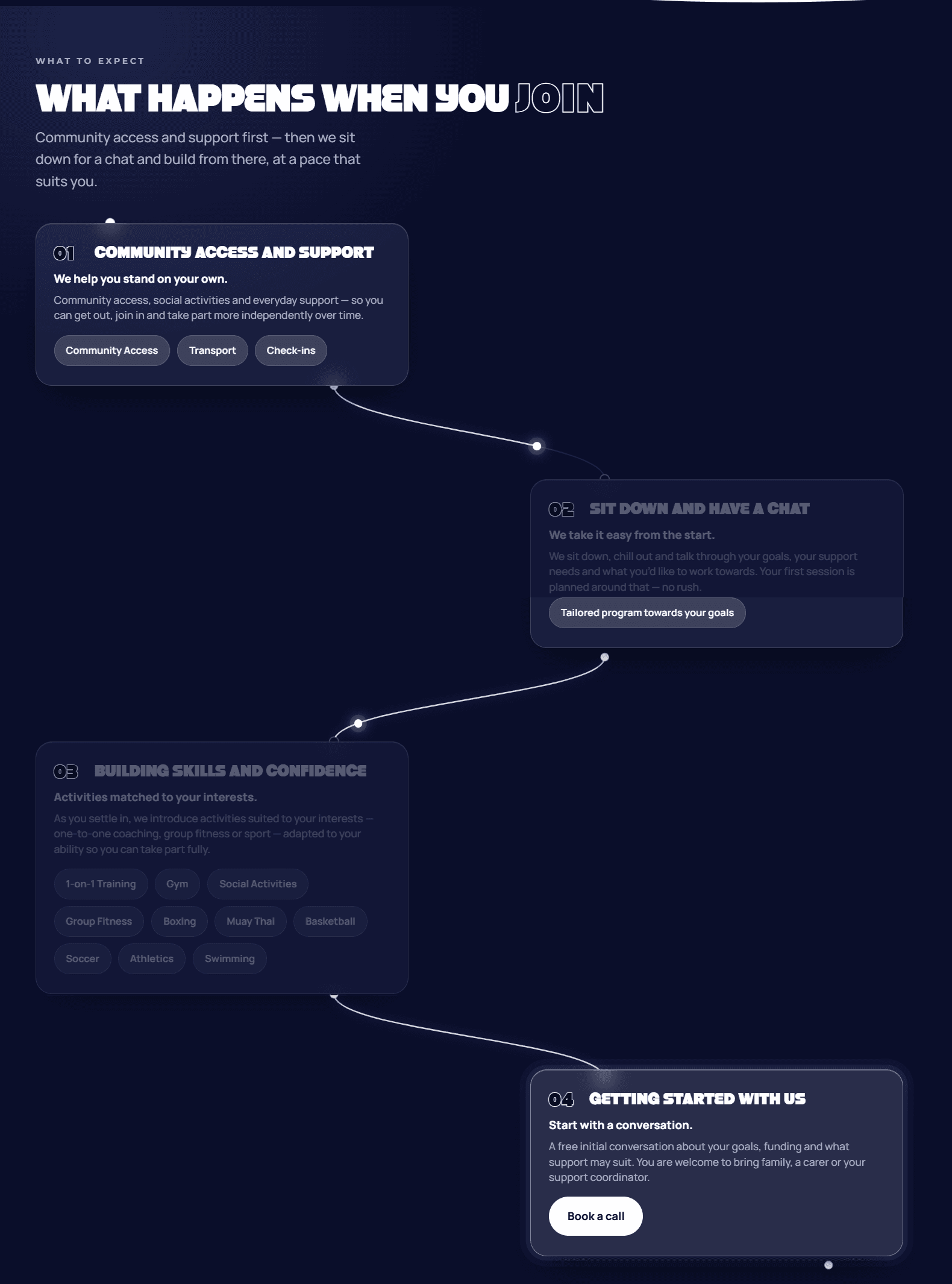
One section had to answer the only question that really matters: what actually happens if I join? It took ten versions. A swipe deck on mobile with something different on desktop, binned for having two mental models for the same content. A drawn path down the page, binned because the line ignored the cards. A line threading visibly through glass cards, binned for looking cluttered.
What shipped is solid cards with the line running behind them, so it disappears under each card and comes out below. The line is built from where the cards actually sit on screen, and each card lights the moment the line reaches it. Measured, not a guessed scroll percentage. Versions four to nine were not waste. Ten only exists because of what they ruled out.
A real calendar, not three chips
The first attempt used morning, afternoon and evening chips. Rejected, and fairly. That is the pattern you reach for when you do not want to build a calendar.
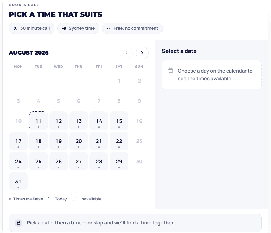
The rebuild is a proper month grid. Monday first, past months locked, three months forward, with real thirty-minute slots from 8am to 7pm. Twenty-three on a weekday, fewer on Saturday, closed Sunday. Today gets a dashed outline and your pick gets a solid fill, so the two can never be confused. It reads your timezone back to you and it works entirely from the keyboard. And I checked the leading blanks by hand across month boundaries: August 2026 starts on a Saturday and needs five, November needs six, February 2027 needs none.
It looked like it worked. It didn't
The contact form showed a thank-you screen and threw every enquiry away. Two separate causes. The function had been written to a different host's conventions, so it never ran at all. And the front end had a leftover preview fallback that showed success when the request failed.
For a business whose entire pipeline is inbound enquiries, that is the worst kind of bug. Invisible. Both fixed. It now fails honestly and hands you the phone number instead.
Built instead of bought
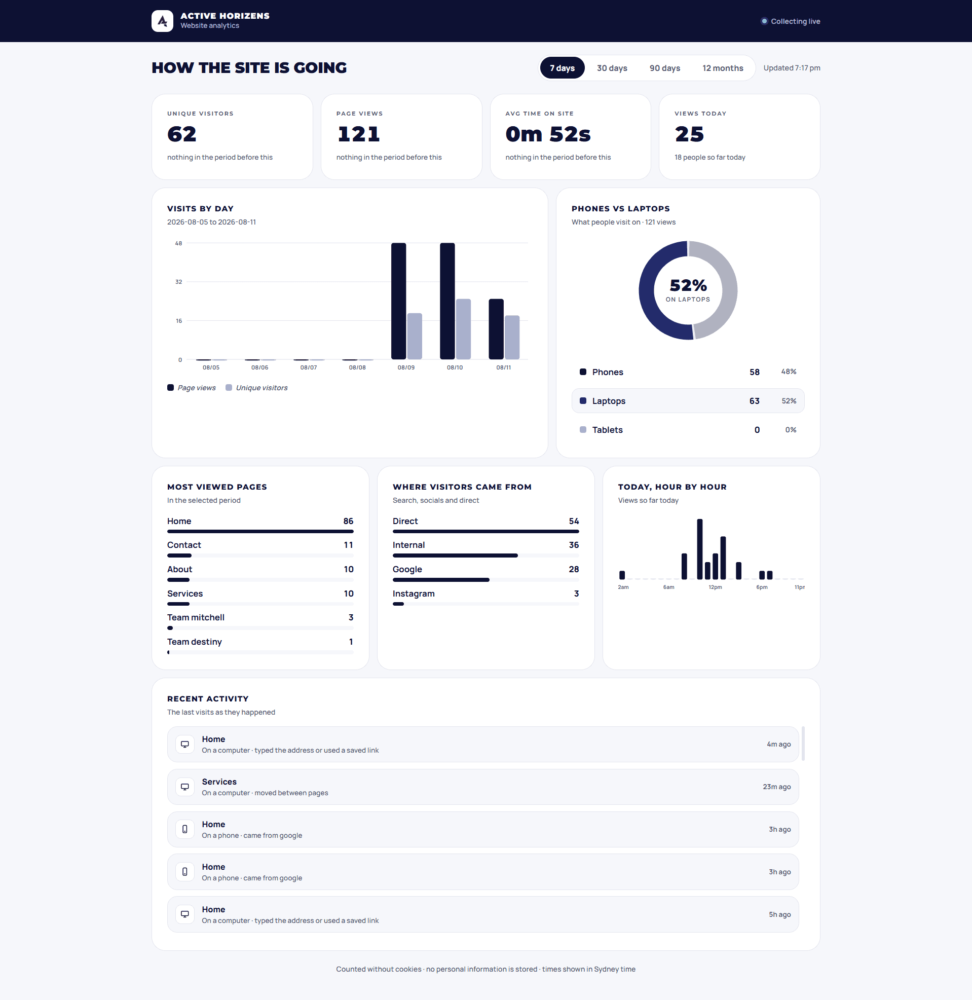
They wanted to see how the site is doing. Buying that in meant another account for them to manage, another cookie banner, and no ownership of their own numbers. So it is part of the site.
Visitors get counted with a daily hash of the date, the IP and the browser. The raw IP is never stored, and because the date is inside the hash the identifier changes every day. No cookies, so no banner, so nobody clicks reject all and disappears from the count. Days start and end in Sydney time, so today means their today.
Every number either renders from the API or renders as a dash. There is no placeholder data anywhere in the production file. And the change-versus-last-period percentages only appear on the 7 and 30 day views, because those are the only ranges with a complete previous period sitting behind them. Showing a delta against half a period is lying with numbers.
The best feedback came from the client
They came back and asked me to take out the absolutes. Nobody's judging. No surprise bills. Never. Always. Guaranteed. All warm, all human, and all promises two people cannot keep every single time. For a provider working under NDIS obligations that is a liability, not a voice. Every one got rewritten into something they can stand behind.
We aim to provide a welcoming environment for participants of all abilities.
We discuss any additional activity or venue costs with you before they occur.
We work with participants as an independent, unregistered provider supporting self-managed and plan-managed plans.
Supports can be reviewed and adjusted as your goals change.
Less fun, much more true
It went from “Nobody turns up and plays a game of football on day one” to “Support is built up gradually, at a pace that suits you. Here is how it usually works.” I liked the first one. The second one is the one they can defend.
Four categories, real rates
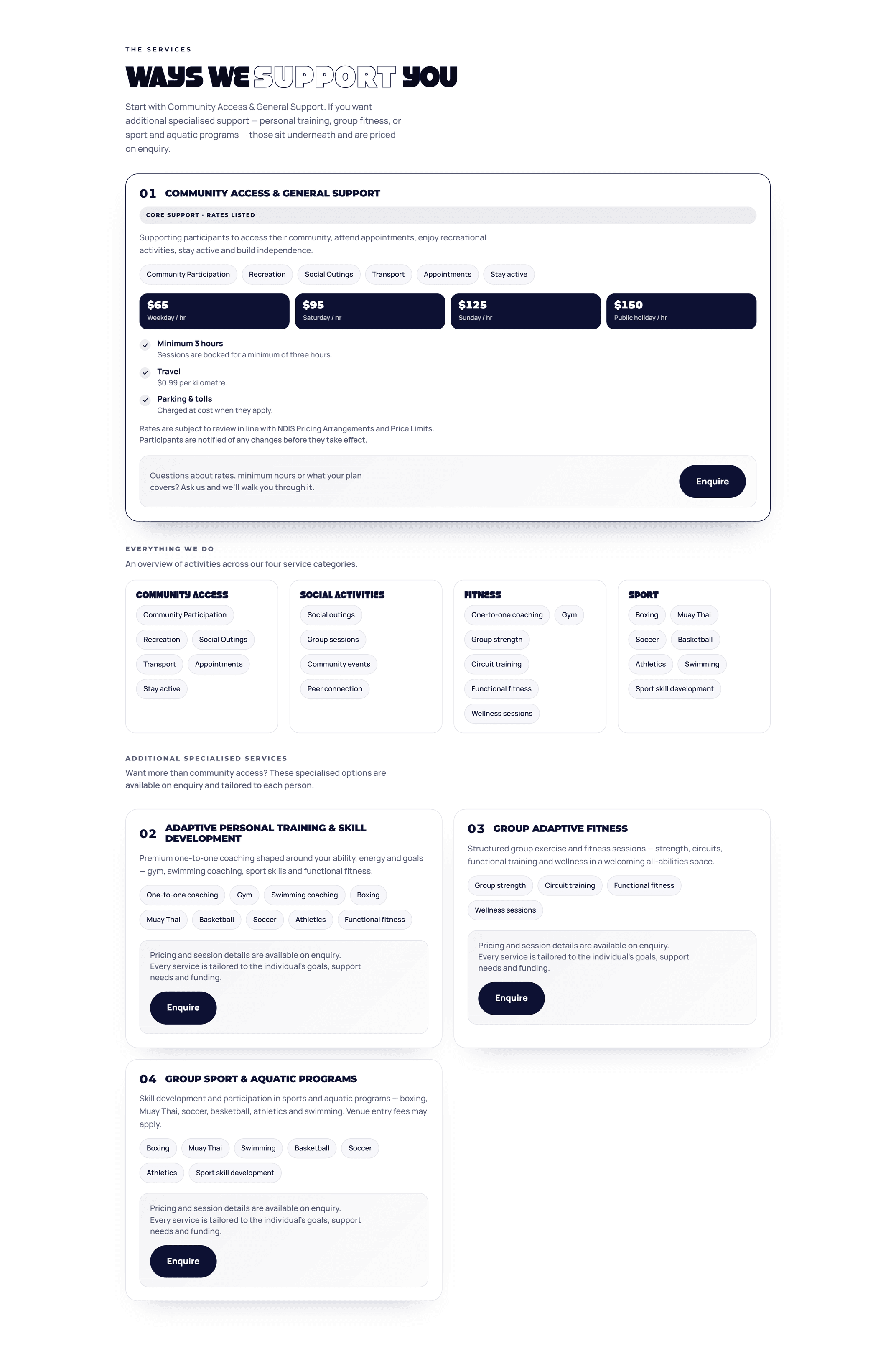
Restructured at the same time into the four categories from their actual service agreement, with the canonical pricing on the page. Anything bespoke gets an enquiry card instead of a number.
- $65 weekday / hr
- $95 Saturday
- $125 Sunday
- $150 public holiday
- $0.99 per km
Read the paperwork. Check the maths
Three habits that did more for this project than any design decision.
Read the legal paperwork
Their service agreement settled the pricing, the compliance wording and about half the copy questions on its own. It was more useful than the brief was.
Say it exactly, or it won't get done
I first sent the copy changes as a written description and they came back wrong. So I rebuilt it as a find-and-replace table. Exact text out, exact text in, a warning that a sentence might be split across two HTML tags, and another that em dashes show up in two different encodings. Plus a report back listing every file changed and every string not found. Precision in the instruction is precision in the output.
Check the geometry, don't eyeball it
Before shipping I simulated the curved connector line against the real card rectangles in Python, at both breakpoints, to prove nothing overlapped. Same for the calendar blanks across month boundaries. Both caught a real bug the client never saw.
Live, and findable
Verified and indexed
Search Console verified by DNS record, a sitemap, and a robots file that keeps the analytics dashboard out of Google.
LocalBusiness markup
Covering the service area, both owners with their real credentials, all four service categories and the published hourly rates.
Hours, ratings, address
The hours were not confirmed, there were no reviews yet, and they travel to participants so the address stays private. All three would have been easy to invent. Fake ratings break Google's rules, and invented hours send a family to a locked door.
Keniye Platform, Atlas — Cinematic Scroll Experience, VEIL — Luxury Streetwear Platform, MERIDIAN — Hypercar Configurator — more case studies from D-LAB.
Two people, properly equipped
If your website is the first thing a nervous person meets, it has to do more than look good. Tell me what yours has to do.
Start a projectBack to experimentsRates shown are Active Horizens' published rate card at the time of writing. NDIS pricing, registration status and service categories are set by the provider, not by D-LAB.